• Point 1. Again Lean Back
It is natural to watch videos of personal preference on their mobile devices rather than on TV. In the meantime, one of the reasons why users turn on the TV is to watch it on a big screen, and some recent services have forced users to give Lean forward.
To make it available in simple and intuitive navigation, we suggest a design that reduces elements at different levels and reads easily within one screen as much as possible.
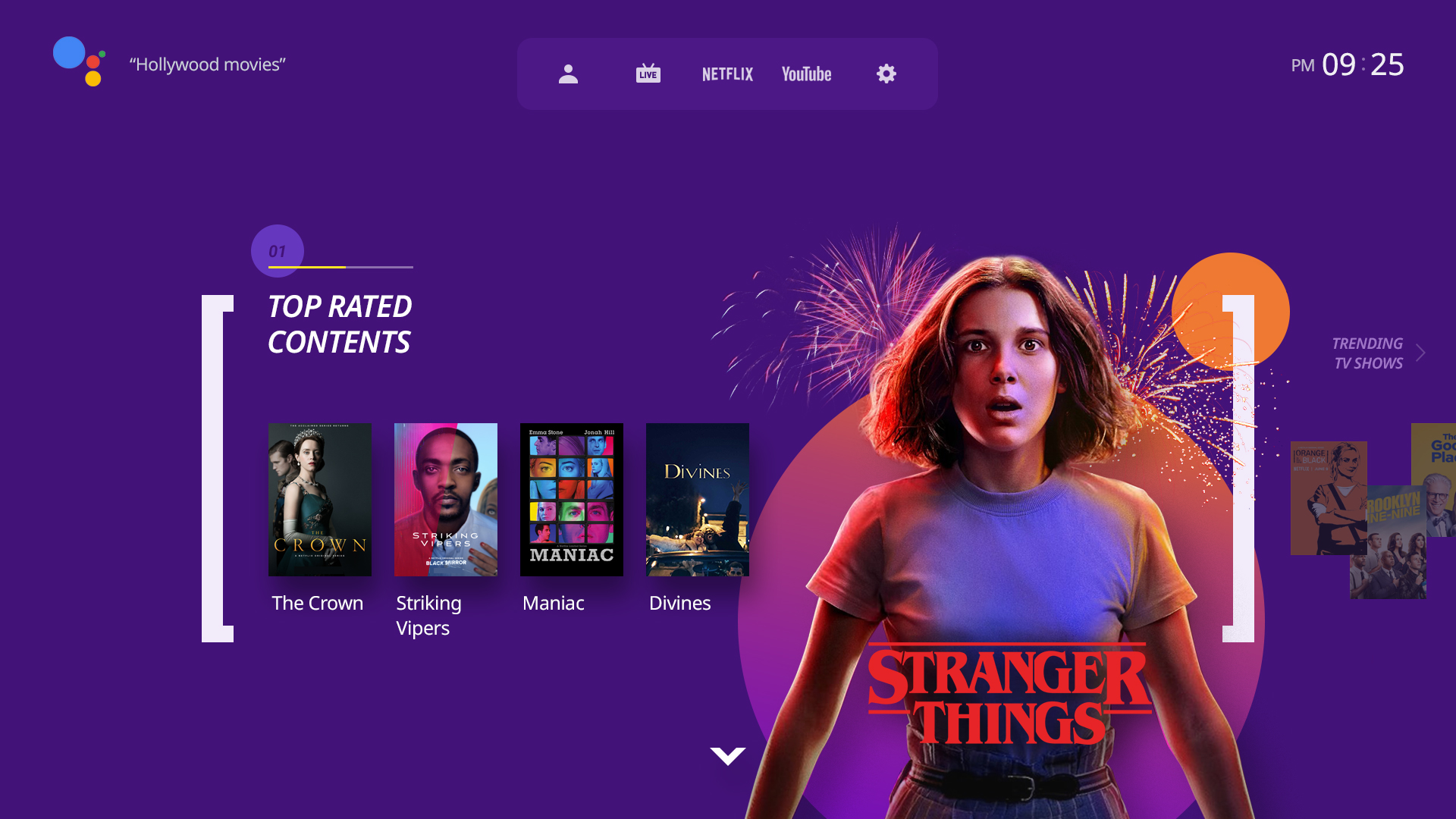
A.UX:Clip main screen : showing bunches of content per popularity and personal
• Point 2. Browse Less, Discover More
The required process to reach content playback is navigation or search.
For users who habitually turn on the TV, navigation should be easy, and voice/text search accessibility should be easy if they have content or actors they want to find. While this flow is provided by default, most services often place operators' promotions or event banners in the middle of the route.
If personalization and recommendation algorithms are further strengthened, we will be able to plant meaningful advertisements and promotions than now. But it needs preceding investments on platform establishment and viewing data gathering/analyzing. It will be difficult for the time being for most operators, therefore, focusing on the content list would be more effective to develop a new UX as of today.
The contents were categorized by listing only three types of real-time channels, VOD, and characters, and arranged to follow the relevant recommendation path according to the starting point.
Content list according to the keyword on the top: VOD, channel, and characters
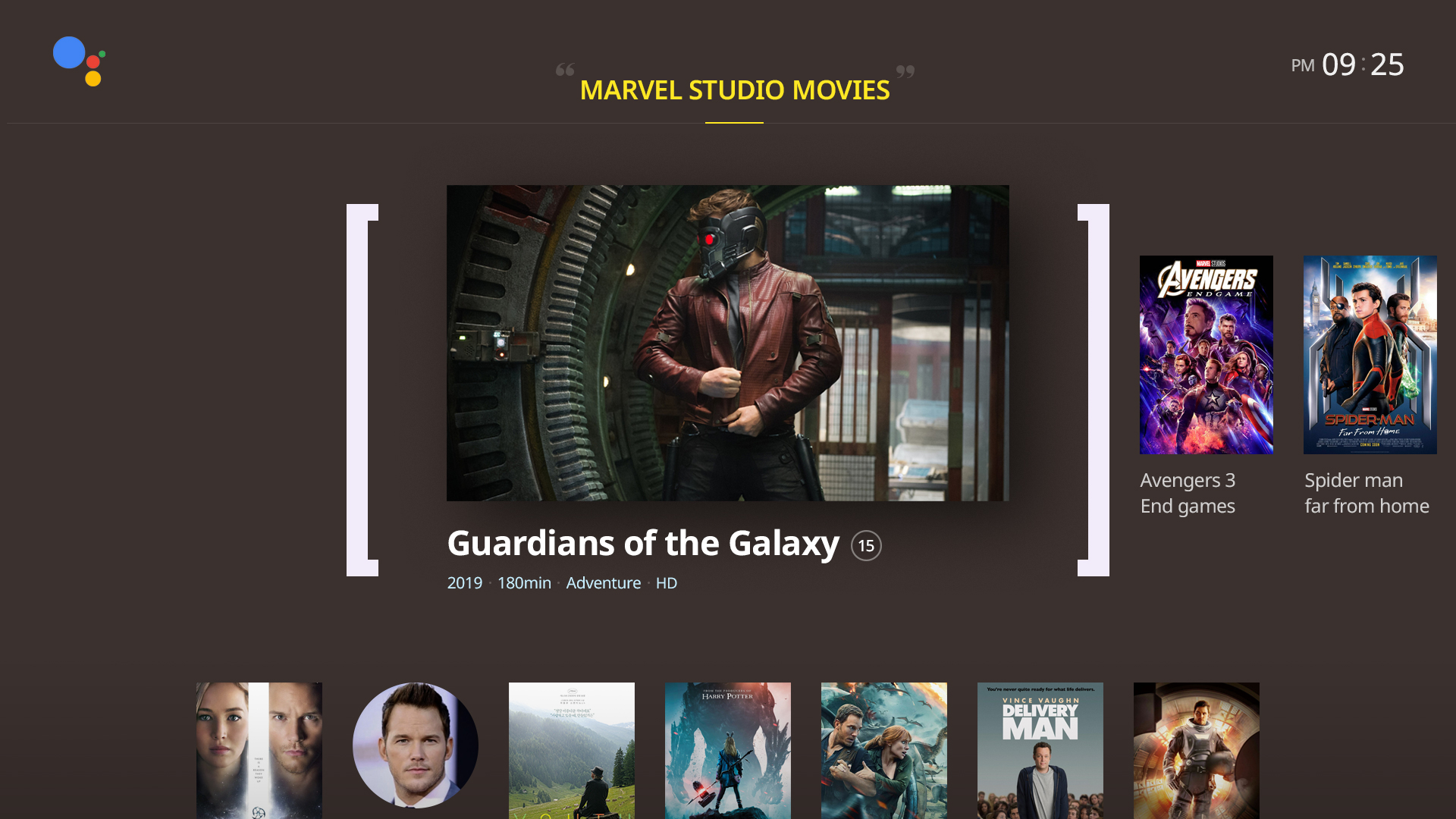
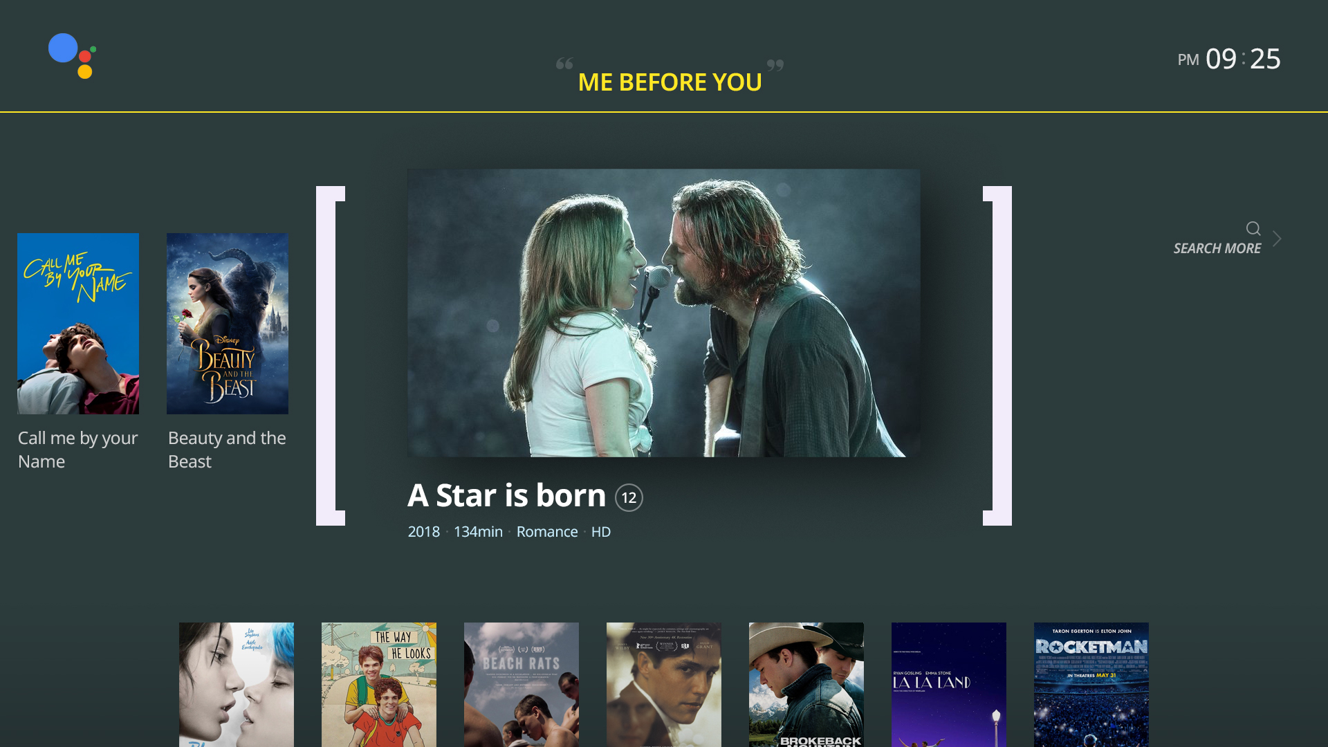
In particular, we would like to emphasize the simplification of navigation, which is characterized by the fact that the same level of content can be checked in the horizontal direction, and that the lower depths are carried out on a focus basis according to the starting point.
When navigation starts down from the starting point, the list of related content continues. It leads to the path of content that you want to watch along with a similar atmosphere and genre, not the usual category or menu tailored to the framework of the operator.
Search appears at the extreme right of content list
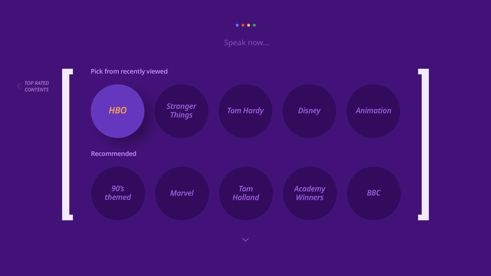
Recommended keyword offering on search: based on recent watches and popularity
If you have content, people, or keywords you want to find right away, run a voice/text search to connect you to the results. In the real-time channel schedule, channels and programs can be searched as a priority.
Additionally, for users who abandon their quest while searching, the last right-hand point in the landscape direction supports the user with a choice of keywords. Based on the content you've watched, you can suggest a starting point for finding a new path by presenting people, keywords, etc.
• Point 3. Focused
As the services offered on TV have increased, menu structures and screen configurations have become more complex, and complex screens have made users need more time to learn. The idea is that more than 50% of users still do not press the "menu" key of the remote control and that they should not miss the easy and simple way of using a TV in the current situation where profits such as VOD can be generated only by entering the menu.
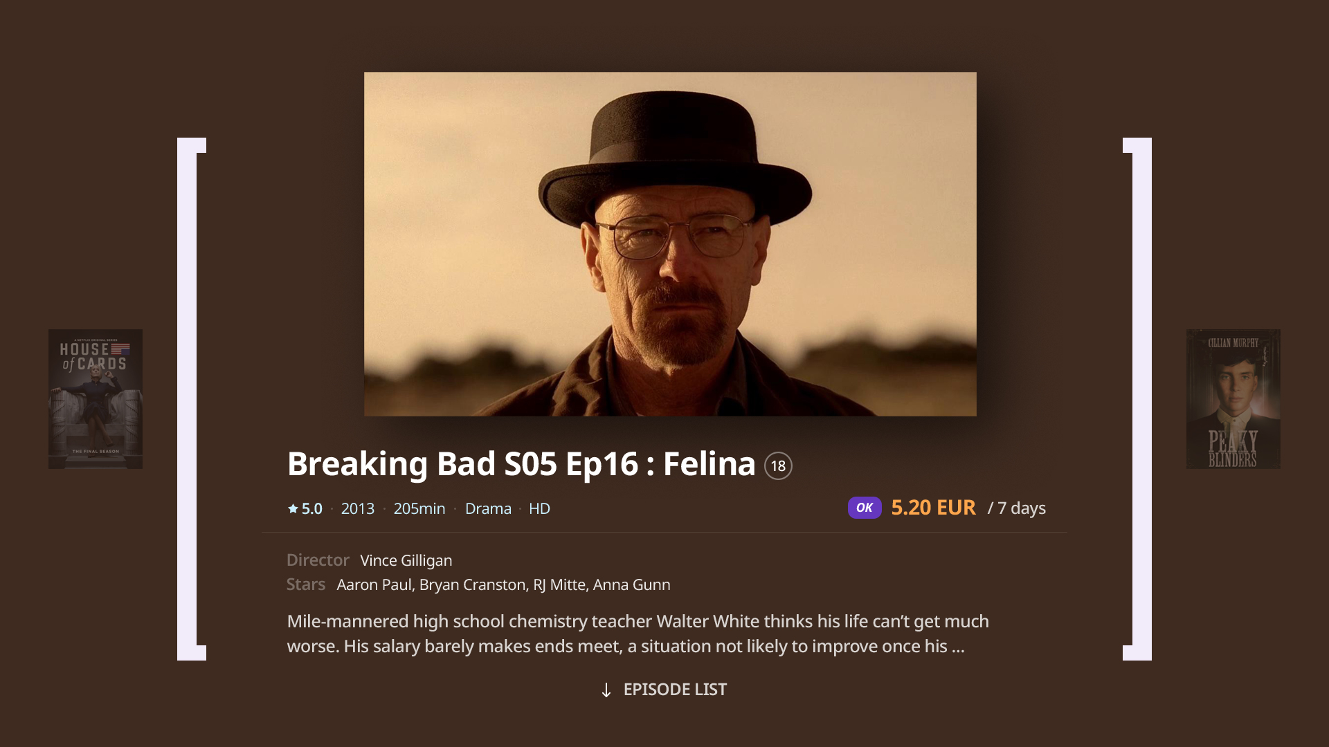
The layout is composed of screens that can focus on content from a large screen. In the square brackets, when loading is complete, some information on the content can be viewed before entering the detailed screen by playing the video. Intuitive implementation of entry and departure is made through natural interaction when choosing square bracket contents.
VOD detail: metadata is shown up while the preview video is playing
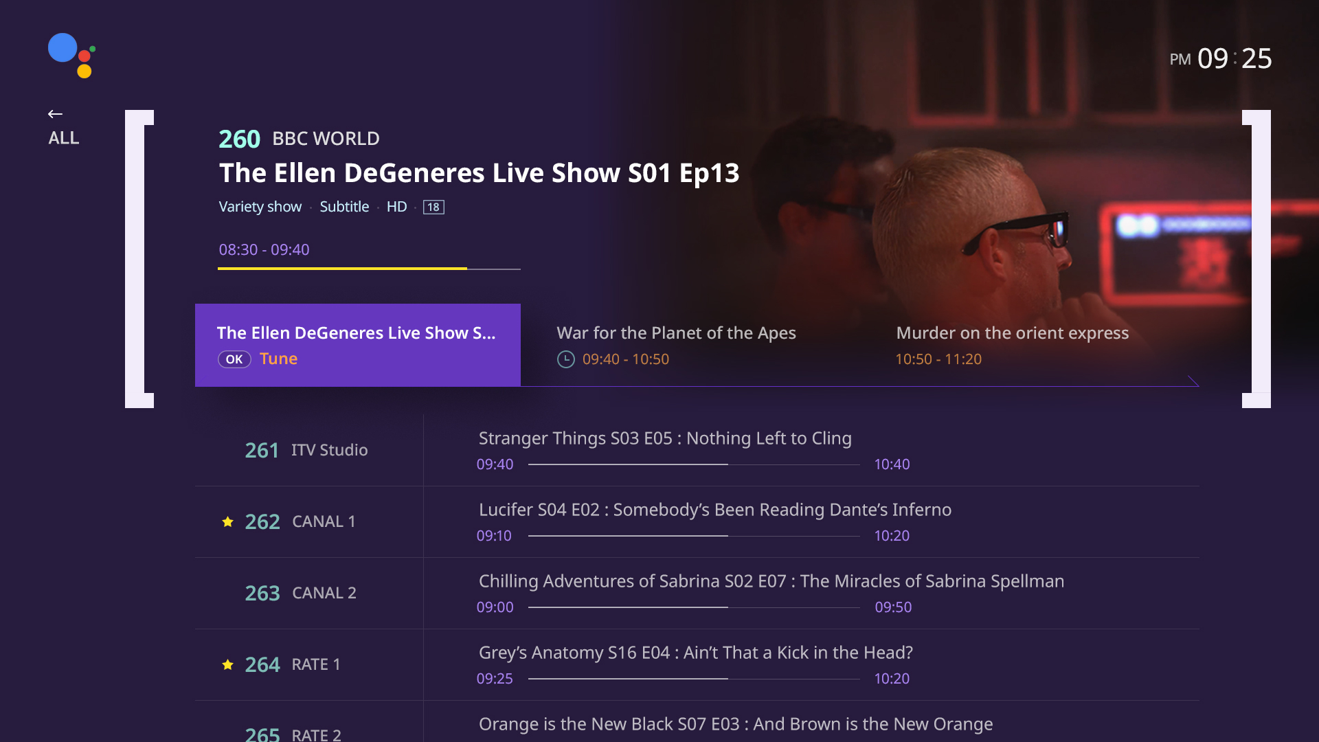
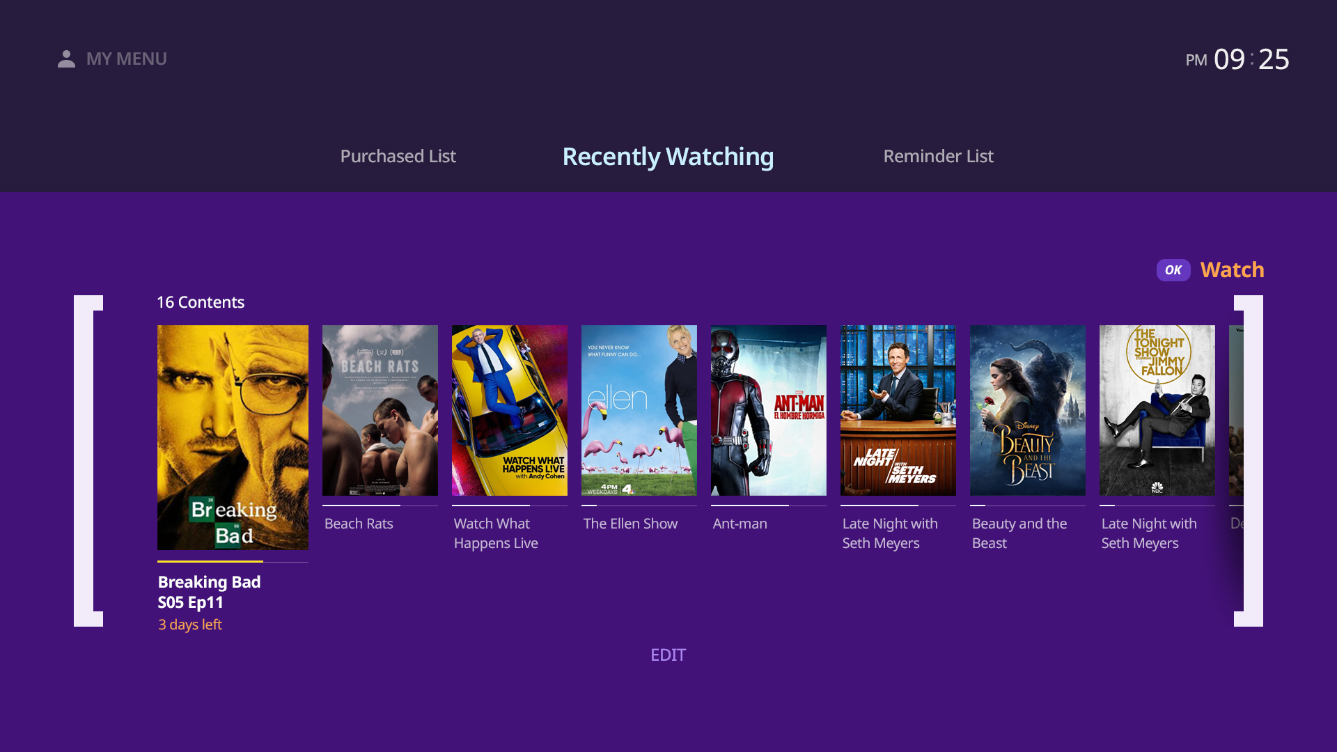
In addition to VOD contents, the screen displaying information is organized by separating the main and sub-information focusing on the main contents. The channel schedule provides information and PIP(Picture-in-Picture) of focused channels in fixed areas and allows user setup in simple structures in My Menu and Set Menu.
Program guide :
focused channel’s video/audio showing via PIP(or PIG)
My menu and setting screen

